Context: Winner project for best UX and population health & patient engagement challenges at CMG's Need for Speed Hackathon Boston. My role: UX & UI designer.
Apps used: Sketch, Invision.
What I did: UX & UI design, feature prioritization, flowcharts, wireframing, interview, Invision prototype.
The Problem
Alarm fatigue is a serious hazard in the care giver health industry. Monitors help save lives by alerting nurses that a patient could need help but with constant sounds and so many false alarms, nurses become desensitized. In the worst case scenario, leaving patients to die without anyone rushing to their bedside.
Busy nurses need a way to:
Keep track of patients’ conditions
Prioritize
Make the right call
The Solution
NurseBadge
A wearable that helps nurses provide the right care at the right time. NurseBadge updates nurses with important events that have occurred with patients since their last shift, notifies them appropriately according to severity of the alarm, and facilitates communication with other nurses.
wearable design vs. app
Visual representation of wearable device
Nurses are on the go!
Avoids distracting
Personal notifications
Better protects patient privacy
Maintains proper medical hygiene
I will go over the process below....
...But first some UI design
The Process
Discovery
Researching about alarm fatigue and nurses in the U.S. healthcare industry we discovered the following:
Alarms are the leading health-device technology hazard.
An estimated 85% to 95% of alarms are false.
Nurses have become desensitized to alarms.
There’s widespread understaffing of nurses.
Nurses are overworked because of understaffing.
It can be hard for nurses to detect where an alarm is coming from.
It can be difficult for nurses to even hear an alarm.
Brainstorming
Brainstorming:
Nurses are overworked.
Healthcare facilities are short-staffed.
Many alarms are false.
Nurses need to know when an alarm requires immediate attention.
They need a way to prioritize care/alarms.
A way to record what happened to patients.
Can the nurses hear the alarms?
Nurses need to provide care in a timely manner.
Interview:
We conducted a phone interview with a nursing facility nurse to help us understand how alarms are used. The following are some of the insights we got:
They are short-staffed. Many residents (patients) per nurse.
Different devices have different alarms (ex: heart rate monitors, IV, etc.)
Nurses leave written and verbal reports at the end of their shift.
Residents (patients) with dementia/Alzheimer’s have an alarm on bed.
Check patients by sight
Nurses need to go up and down stairs all day.
It can get very busy
Prioritizing care is extremely important
Feature Prioritization
After our research and brainstorming sessions were done we started to prioritize the features for our wearable device. Some of the features and items to add include:
Alert prioritization - color-coded (yellow: low, orange: mid-range, and red: critical)
Task screen containing all non-critical alerts.
Critical alerts (red) will pop-up immediately.
A way to tell if a patient has been waiting too long for a non-critical alert.
Have a patients' log
Be able to see patients' profiles (medical included).
Nurses can respond to alerts.
Have access patients' profile when responding to alerts.
Be able to "rate" the alert (Nurses can use their judgement of the situation)
Nurses can add comments of what happened.
All nurses can access notes under patients' profiles.
User flowchart
User flow chart - Alerts flow
Having figured out the main features I led the user flow session. This is where we established the main flow and screens for our wearable device. The main flow shown here is for the alerts.
I will go into more detailed description of the screens further below.
Wireframes
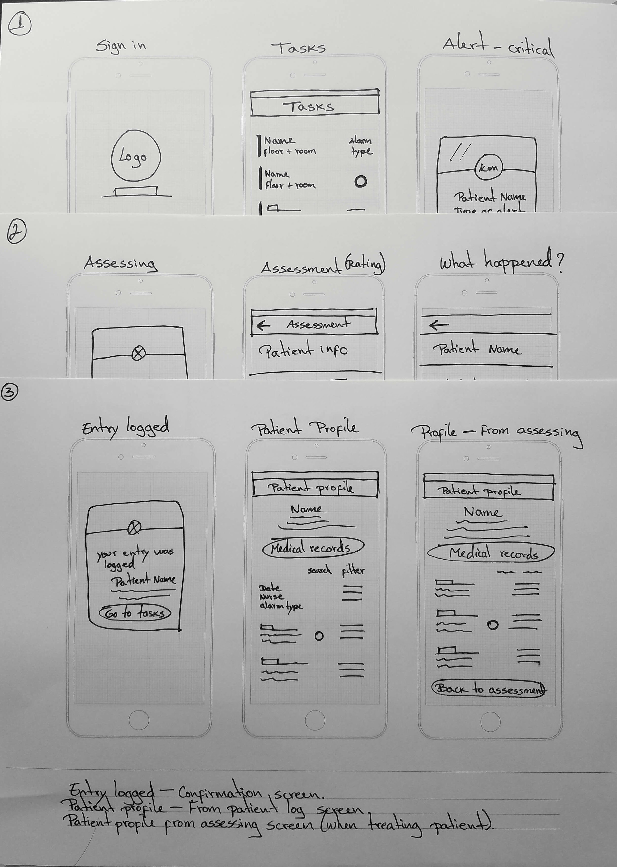
Wireframes - 4rd version
Wireframes allowed me to freely explore many different UI options in a short amount of time. They also served as a way to visualize the final product and the hierarchy of items on the screens.
User Interface Design
After I decided on a layout and the hierarchy of items on the screen I designed the UI. Below are the finished screens with with their respective descriptions.
Sign in - Every nurse has a unique PIN to sign in. It allows to keep track of who provided care to patients.
Tasks screen - Tasks are color-coded by severity. Yellow being the lowest (routine care). Orange is a middle-range alert. A blue outlined circle means the patient has been waiting longer for care.
Patient log - Shows the patients nurses are responsible for during their shifts. Nurses can see at a glance if important events occurred with patients since their last shift.
Patient profile - Has day-to-day nurse reports about the patient. Days where critical or mid-range alerts happened are color-coded. Profile also has quick access to the patient’s medical records.
Alerts - Red alerts are critical alerts, they will automatically pop-up on the screen. They provide critical information such as patient name, floor, room, and type of alert (ex: Heart rate monitor).
Assessing screen - Nurses can access the patient’s profile to see medical information if they need it to provide care. Once done providing care, nurse can complete the assessment.
Assessment (rate screen) - Nurses can use their expertise to rate the type of alert they actually attended.
What happened? (Comment screen) - Nurses can leave notes of what happened. Speech-to-text available.
Logged entry confirmation - The entry has now been recorded to the patient’s profile.


